Don’t waste your captions: How to emphasise key messages in technical documents

When writing a document that has to convey a lot of information, it’s natural to focus on optimising titles, headers and the body text. But even if these aspects are crystal-clear, text-heavy documents longer than a couple of pages will probably remain mostly unread. Here I take a look how to subtly reinforce your key points by making careful use of captions, as well as other undervalued pieces of text such as labels, boxed text and pull-quotes.
Catering for the skim-reader
When writing a text-intensive business document – such as a white paper, case-study, report, or even a brochure – I spend a lot of time on the title (to grab attention), the headers (to add structure), and the body text (to convey the message). But I also give plenty of thought to captions and figure labels, because I think they help get the message across to the reader who’s just skimming through the text.
Wait a minute… what’s all this about “skimming through”? Surely everyone will read my document from start to finish?
Like it or not, it’s a fact of life that no-one reads a multi-page document unless they’re really interested in the subject (or they’re a business competitor…). Even if it’s well-written, all you can reasonably hope for from the majority of your readers is a 30-second skim-through – enough time to get across one or two key messages. If you’ve been wise, you’ll have made sure these are covered prominently in the executive summary, abstract or standfirst, and again in the conclusions, if the document has one.

Making the most of undervalued text
But to increase the chance that the reader will pick up on these and other points, we need to grab their attention and slow them down – and that’s not achieved by focusing solely on the body copy. One approach is to put some of our passages in bold, but this may be out of keeping with the style the reader would expect for a white paper, report, or case-study.
Fortunately, there are more subtle but equally effective ways of tackling this problem. These involve making good use of the pieces of text that by their very nature are formatted differently from the main text.
Captions and labels are the most commonly encountered and hence the most useful, but in certain circumstances boxed text and pull-quotes are also very handy. I’ve described each of these below, and also included a few real-life examples I’ve found of them being used effectively.

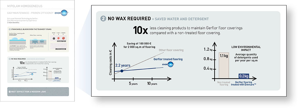
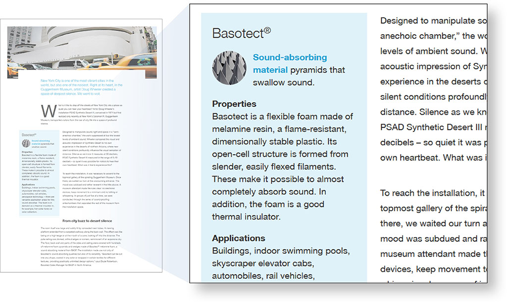
#1: Describe the upshot of the data in your captions
A lot of technical documents fail to make the most of captions for images, schematics and tables. Naturally, we include the basic information to allow the images to be interpreted, but too often as scientists we stop there, and fail to convey the upshot of the data we’re showing.
Captions are great places to say not just what the data shows, but what it means to the reader
This is a missed opportutity, because when skimming a document, your eye is naturally drawn to any images – followed by the caption (especially if the image needs a bit of explanation). So the caption is a great place to bring in the take-home message too: not just what the data shows, but what it means to the reader.
And don’t be afraid of repeating something in the caption that you’ve already said in the body text – it’s another opportunity to get your message across. Just avoid a direct word-for-word repetition by finding a different way of saying it, or by adjusting the level of detail.
#2: Use labels to indicate the important features on figures
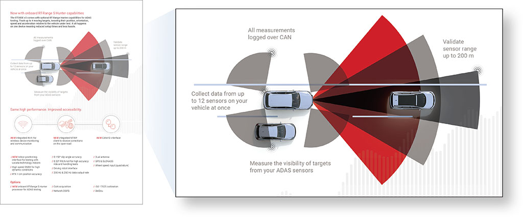
Closely related to captions are labels – the little bits of text on an image. Sometimes these are inherent to it, such as axis labels or legends on graphs. But adding new labels to an image is also a great way of attracting attention to its most important features.
For example:
- Labels added to software screenshots can indicate key features of the user interface.
- Labels added to graphs can explain the trend shown, and perhaps the reason for it.
- Labels added to complex data-sets can highlight inconspicuous but important features.
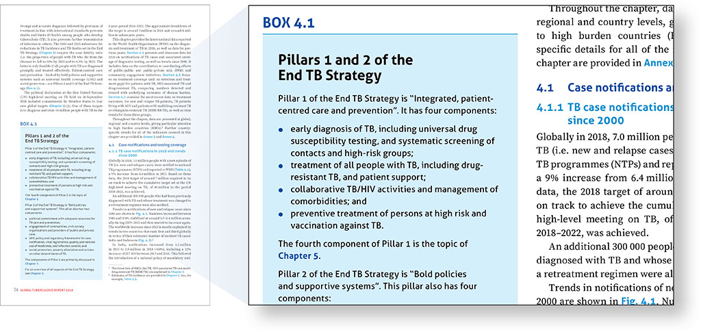
#3: ‘Box-out’ background information
Quite often, the reason for lack of focus in a document (and a bloated word-count) is the inclusion of background information. Perhaps this is a recap of some fundamental principle, standard or technology, or maybe it’s a quick product overview.
Such information may be helpful in understanding the broader context for those readers new to the subject, but for most it’s unnecessary, and simply gets in the way of the point you’re making.
Boxed text is an elegant way of providing extra information without burdening the body copy
Directing readers to another download (or a page on your website) is perhaps the best way of resolving this, but if you’ve got to make the document stand on its own, then you may want to play it safe and include it.
You can simply do this with a header indicating ‘Background to…’, but a better approach is to ‘box it out’. This is commonly used in magazine layouts to provide additional information that the reader might find interesting… and there’s no reason not to use it in technical literature too. It’s an elegant way of providing that extra information without burdening the body copy, and its surprising that it’s not used more.
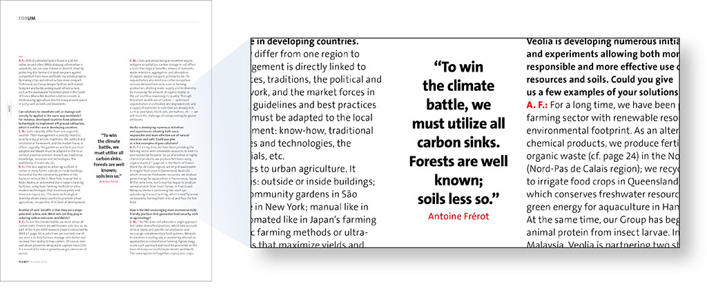
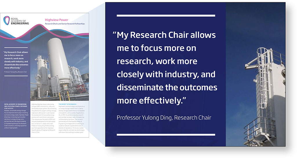
#4: Use pull-quotes to highlight striking statements
If your article incorporates quotations, then don’t forget the power of a ‘pull-quote’ to attract attention to the most striking message. Once again, this is common in editorial pieces for magazines, and is increasingly used in B2B case-studies too. A short sentence from a happy customer is, word-for-word, probably the most powerful sales tool you can use.
In conclusion
Ensuring your message comes across clearly to the reader involves more than refining the words in the body text. This is because very few people rarely start at the top of page one and work their way through to the last line of the last page. Most readers will look at sections with more visual interest, and ignore large swathes of uniformly presented copy.
To cater for this as writers, we need to pay careful attention not just to the way that titles, headers and body text are written, but also to other elements on the page that naturally attract the eye – especially captions and labels. Boxed text and pull-quotes, so long as they’re not over-used, can also be powerful ways of highlighting information that would otherwise be buried in long sections of text.
So don’t forget captions, labels and other textual ‘extras’ in your document – give as much attention to them as you would for the rest of the content, and you’re pretty much guaranteed to benefit from improved levels of reader engagement!