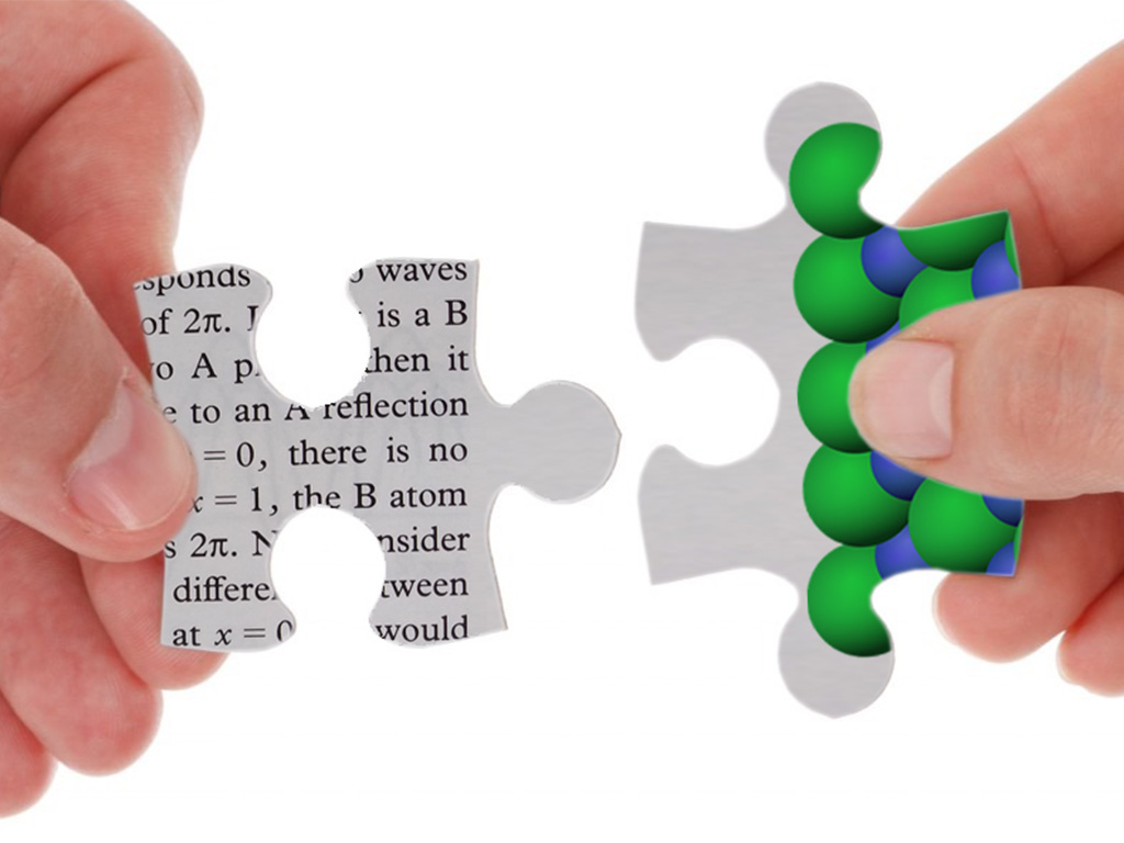
Improving your scientific literature by integrating writing and design

As scientists who have a product or service to sell, we know every detail of what we’re offering, and we’re well-practised at communicating the benefits face-to-face. But when transposing this message into a piece of company-branded literature, how do we ensure that the words and the graphical information work together seamlessly?
Assembling the written content
So you’ve been tasked with writing a white paper, brochure, report or some other piece of text-based company literature.
Let’s assume you’ve already been through the well-established company process for creating some written content. You’ll have made sure there’s sufficient background information, that all the key data is in there, and that the product benefits come through clearly. Then you run it past the necessary people for sign-off.
So far, so good, but then comes the task of making sure it looks professional and ‘on brand’. So maybe you’ll get someone in the office to drop it into the company Word template? Or perhaps you have a design agency who you regularly work with?
Either way, you’re treating the writing and the layout as separate tasks. Although it’s commonplace to do this in many industries, when technical information is being conveyed it isn’t a recipe for success.
What can go wrong at the layout stage?
Failing to consider the text and the layout at the same time can really make it difficult to achieve an effective piece of scientific communication. Do any of the following problems sound familiar?
- A column format that means the reader is constantly having to scroll up and down the page to follow the text.
- Technical figures and the accompanying discussion being on separate pages, so the reader has to flip back and forth.
- Bad word-breaks that cause the reader to do a ‘double-take’.
- Unnecessary repetition (or worse, inconsistency) between figure captions and labels on the figure itself.
- Complex figures that are squeezed to fit the column, and hence too small to read without zooming right in.
- Figures containing text labels (often added in PowerPoint) that are much larger than the body text.
- Screenshots containing irrelevant or distracting information (data-set filenames and the like).
The consequences of a poor layout
As well as giving a poor overall impression, all of the above layout problems test the reader’s patience by extending the amount of time it takes for them to find what they’re looking for, or by making it difficult to understand what the key message is supposed to be.

This can be bad for your brand perception, and – especially if you’re trying to sell something – bad for your bottom line too. If you can’t put together a document that’s fit for purpose, why should readers believe that you can do the same for your service or product?
Making the text and images work together
So what can we do about problems in reader experience caused by a poor layout? The answer is not to get a better designer, but instead to ensure that the writing and the layout are not considered in isolation.
I’d argue that this is especially important for scientific subjects, because the non-text content tends to be information-rich. It includes things like graphs, workflow charts, diagrams and tables – it’s not just ‘eye candy’ that can be dropped in wherever there’s a convenient gap.
For scientific subjects, the non-text content is not just ‘eye candy’ that can be dropped in wherever there’s a convenient gap
Infographics are an excellent example of how text and graphical elements can work together – and the best ones work because the words, the design and the science are considered together, not in isolation.
So what are the approaches?
Infographics are all very well, but what can we do when it comes to brochures, white papers, reports, articles and the like, which are much more text-heavy? I see four options for getting the text and graphics to work in harmony with each other:
- Keep the tasks separate, but tightly define (a) how the text should be written and (b) the rules the designer should use when laying out the piece. This might work for simple types of content (think social media), but in general you may just be creating additional work for yourself, as well as being very likely to get push-back from both sides.
- Get the writer and designer to work closely together, perhaps with regular calls to discuss how the project’s coming along? Of course, this takes time, and even assuming it’s easy to get them ‘on the same page’, then their combined availability may well have an impact on your delivery schedule.

Can you get your writer and designer to co-operate on the same task? - Outsource everything to an agency – and hope that they’re able to get their heads around your specialist content! But note that if you’re dealing with an account manager rather than the actual writer and designer, you’ll effectively be putting someone else in between the source material and the final content. This is unlikely to make the task any easier.
- Find a single person who is proficient in both the writing and the layout… and who can understand the subject matter.
In conclusion
A well-crafted layout is an under-appreciated aspect of communication in the sciences, and one where there is plenty of opportunity to stand out from the crowd by challenging the conventional model of getting one person to write the text, and another to drop the text and images into a standard template.
I’ve argued here that maximum effectiveness in a piece of scientific content is only possible when the words and the graphical elements are considered together during the layout stage. After all, it’s second-nature to do this for a webpage or presentation – why shouldn’t you strive to achieve this for your formal written literature, too?
