Text layout: How to boost the readability of scientific white papers

Writing white papers isn’t just about the refining the words, grabbing the images, and dropping them into your company template. Text layout – how those words look on the page – can be just as important for readability and hence reader engagement. In this post I take a look at the aspects of text layout that can help prevent your scientific white paper from looking like an unappealing ‘wall of words’.
Beyond the words, images, and branding
When you’re creating a B2B scientific white paper or report, it’s easy to think that it involves just three aspects – the words, the images, and the branding. But there’s a fourth, little-appreciated aspect of content creation that plays a major role in the success of a piece of literature. That aspect is text layout.
Text layout is all about ensuring that the writing is well-structured and elegantly presented, so that you help the reader to understand your message in the shortest possible time. In contrast, if your customers don’t engage with the text because it’s laid out as an unattractive block, or the font is too small to read, then all your time spent writing it will have been wasted.

There are numerous aspects to text layout, and their relative importance depends on the type of content you’re creating. But here I’m going to focus on the six aspects that are most important for improving downloadable white papers – a staple item of B2B scientific communication, and one that I’m pretty familiar with.
First up is the most important point of all – the font you’re using.
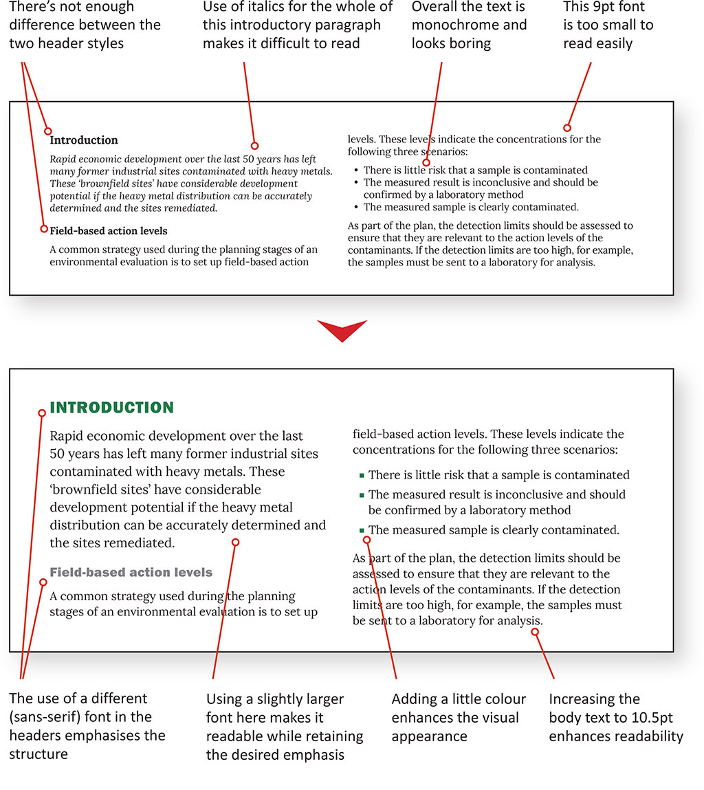
#1: Refine your typography
The fonts you use in your document are the major factor in optimising the other aspects of text layout. Chances are that these will already be defined in your brand guidelines, but that still leaves plenty of choices to make – and these are worth careful consideration.
Perhaps the most important of these is font size for the body text. Many white papers make the mistake of having text that is too small, forcing the reader to zoom-in to read it, and then zoom-out again to navigate to the next section they’re interested in. Such inconveniences make it more likely that they’ll get frustrated, resulting in a drop in engagement.
Each type of text content in a document – such as headers, body text and captions – should be formatted so they’re distinct from each other.
The type of font comes into the decision too, as serifed fonts (like the once-ubiquitous Times New Roman) are easier to read at smaller sizes than sans-serifed fonts (like Arial).
However, technical documents will contain much more than the body text. You’ll have the title, abstract, headers, subheaders, captions, labels, tables, references, footers… and possibly quotes and calls-to-action too. All of these need to be formatted so they’re distinct from each other, yet still easy to read.
All this can be achieved by careful application of:
- Font weights: Such as ultra-light, light, regular, semi-bold, and bold.
- Styles: Italics is the most useful, so long as it isn’t applied to large blocks of text. All-caps and small caps are fine if used sparingly, while underlines should generally be reserved for hyperlinks.
- Font colour: So long as you don’t go overboard, colour can be a powerful ally in highlighting important pieces of text such as headers, bullet-points and hyperlinks, and injecting a little colour into an otherwise monochrome page.
- Background colour: Boxed text or call-outs can be elegantly emphasised using a background colour, if that’s in keeping with your brand guidelines, and so long as the text remains clear and readable.
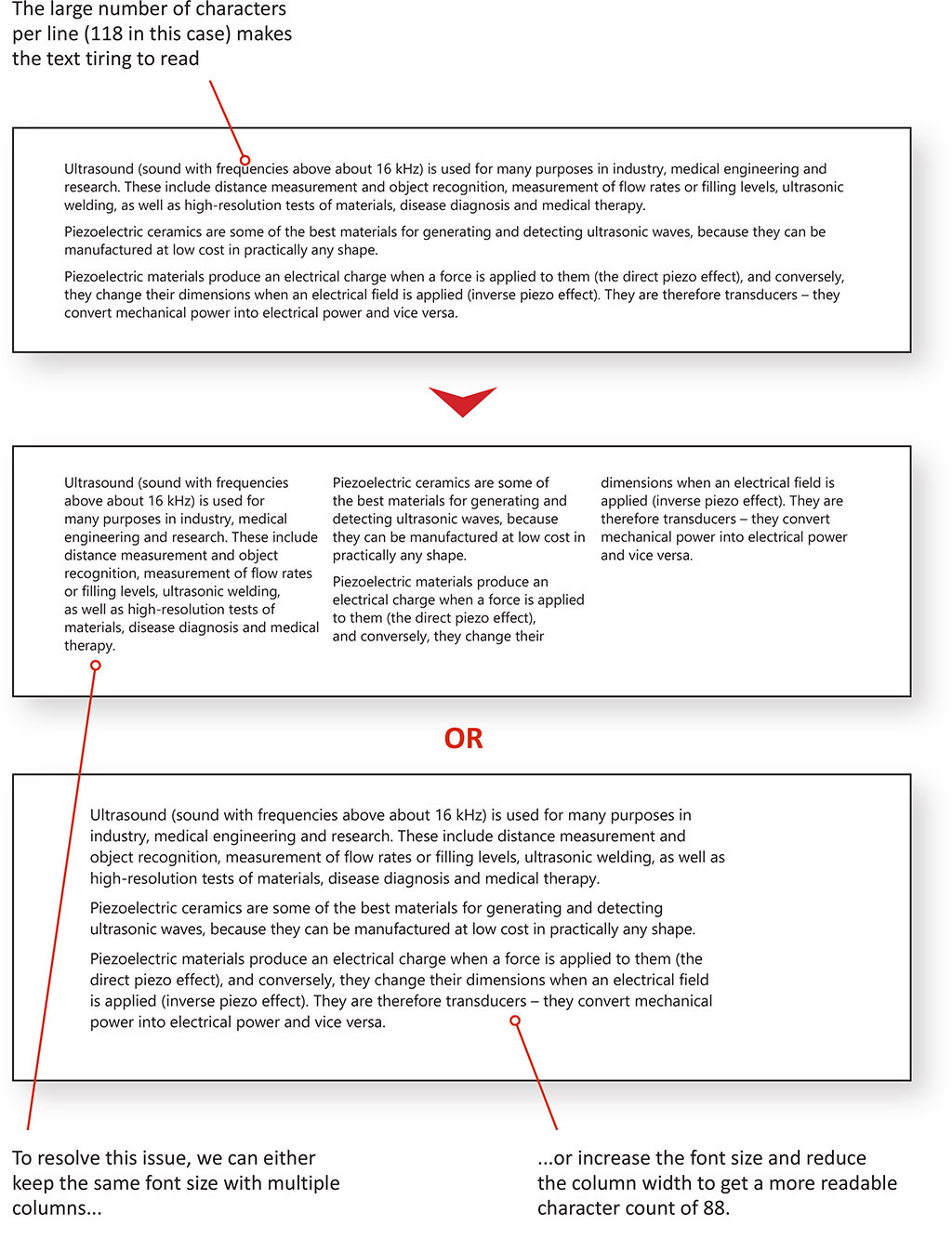
#2: Consider the number of columns
One, two or even three columns – how you divide your text up on the page makes a lot of difference to the ease of reading.
The first thing to think about is whether to use multiple columns at all, as they inevitably mean that the reader has to scroll up at the end of each column, breaking the flow of reading. Multiple columns can also make it difficult to position multi-column figures near the relevant part of the text, because they must be either at the top or bottom of the page.
On the other hand, multiple columns allow you to use a smaller font, and so fit more words on the page (as shown in the example below). This might be useful if your white paper has a lot of words but relatively few figures, but so long as it’s going to be consumed on-screen rather than in print, page count shouldn’t really be your main consideration.
#3: Check the column width
At the same time as number of columns, you need to consider column width. This is important because scanning across a long line of text and then ‘jumping’ back to the left-hand side is tiring for the eye muscles. It also looks intimidating, and can cause the reader to lose their place in longer paragraphs.
Column width is discussed in terms of the number of characters you can fit on the line (including spaces). In these days of on-screen reading, the consensus is that between 80 and 100 characters per line works well, and I agree that this keeps the text approachable and easy to scan. On a portrait A4 page, this can be achieved by careful sizing of the font and judicious application of page margins.
#4: Optimise the text alignment
Having seen a lot of text-heavy scientific documents, I think you can’t really go wrong with left-aligning all your text, although in some cases captions can look better centred or even right-aligned, depending on their position relative to the image.
The other alternative for body text is ‘justification’ – when both the left-hand and right-hand sides of the column are aligned. It certainly can work well, and by avoiding a ragged right edge gives a more formal, journal-like look to the document, especially if used with a serifed typeface (see example below). But the length of scientific words means that the settings need to be managed carefully, to avoid ending up with distracting ‘rivers’ of white space, or weird spacings for symbols and punctuation.
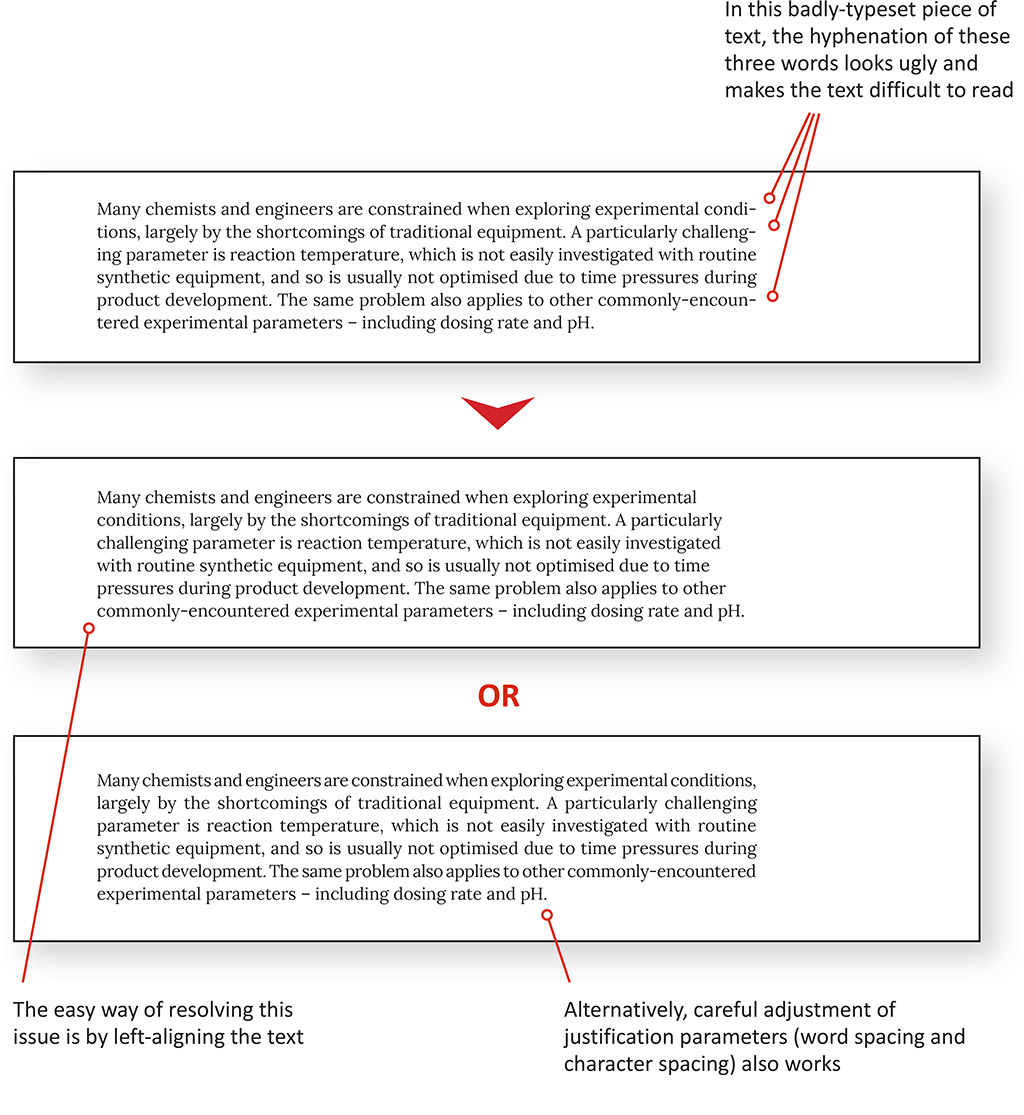
#5: Eliminate hyphenation
This brings me on to hyphenation. This is all about whether you split a word across two lines to avoid the whole word getting pushed down to the second line, and leaving a distractingly large gap on the first line. This needs consideration in scientific texts more than it does in everyday writing, simply because long words are more frequent.
If you’re using a justified format, or a left-aligned format with relatively narrow columns, you’ll probably encounter issues around hyphenation sooner or later. Because hyphenation inherently makes the text more difficult to read, I avoid it in all but the most extreme circumstances. Instead, I prefer to squeeze a little white space out of the offending line to bring the word back into place. I would certainly never ‘orphan’ short word fragments of two letters, as is common in some books and magazines.
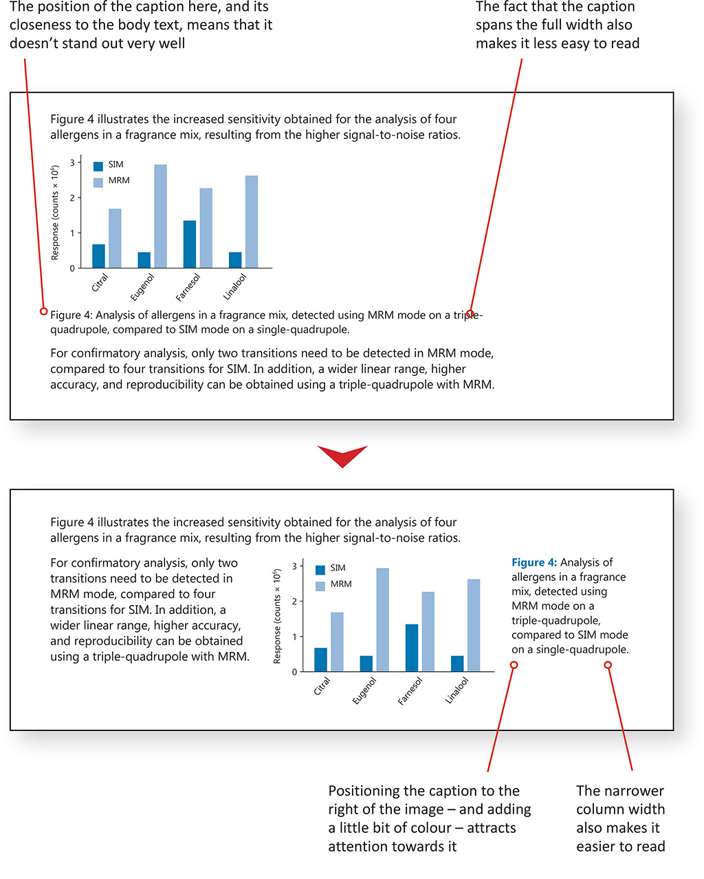
#6: Position your text carefully
Lastly, we come onto positioning of the text on the page, which in scientific white papers is especially important for captions.
We all know the power of images to attract attention. Even in white papers that have a niche audience of technical specialists, it’s reasonable to expect many readers to look at the images first, and then look for explanation or context from the caption. Therefore, because we read down the page and (in Western writing systems) from left to right, it makes most sense to place captions either below or to the right of an image, to follow that same flow.
Placing captions below the figure is the conventional option, and works fine so long as enough white space is used. Alternatively, placing them to the right can work very well, especially if coupled with a distinctive caption style. Captions for tables are sometimes placed above the table, although I prefer to be consistent and use the same approach as for figure captions.
Conclusion: Don’t forget the visual aspects of text
As I’ve demonstrated here, effectively communicating your message in a B2B white paper involves a little more than getting the words and images signed-off, and dropping both into your organisation’s Word template.
Because visual aspects of a document are so important for audience engagement, it’s also important to pay attention to how the text appears on the page. By doing this you can:
- Help the reader to understand the structure of the document.
- Make the process of reading as effortless as possible.
- Subtly emphasise key aspects of the text without being overbearing.
- Make your document look visually pleasing, and in alignment with your brand.
Achieving this isn’t always simple, and there are trade-offs to be struck in terms of font sizing, font styles, alignment, and use of white space… and I haven’t even touched on the formatting of images and tables!
But given the effort that goes into developing and writing scientific content like white papers, I think it’s well worth investing the time in optimising the text layout, for a smoother reading experience.